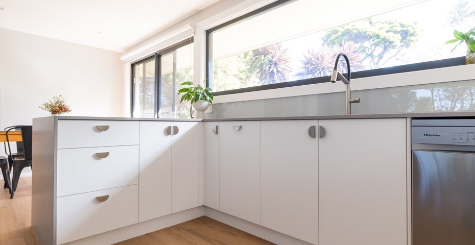
The kitchen sees more daily use than almost any other room in the house, and it shows first on the wall behind the bench. If the benchtops and cupboards are still in good shape but the splashback isn’t, a new one is one of the quickest ways to make the whole room feel new again.
It’s also the part of a kitchen where colour choice matters most. A splashback sits at eye level, catches the light and ties the benchtop, cabinetry and walls together. Get the colour right and the kitchen looks designed. Get it wrong and it’s the first thing you notice every morning. Here’s how to choose glass splashback colours you’ll still love in ten years.
Why glass works so well behind the bench
Tiles have been the default for decades, but glass has taken over in modern kitchens for good reasons. There are no grout lines to stain, discolour or scrub, so a quick wipe is all it needs after cooking. A single sheet of glass reads as one clean, continuous surface, which makes even a small kitchen feel calmer and more open.
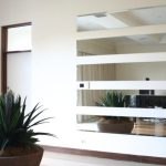
Glass also reflects light. On grey days or in the evening, that makes a real difference to how bright a kitchen feels. It’s the same principle that makes custom mirrors brighten a room, just in colour.
Start with what's staying
The most common mistake is choosing a splashback colour in isolation. Your splashback sits between three things that usually aren’t changing: the benchtop, the cabinetry and the wall paint. Pick the splashback last, and pick it to work with all three.
A few simple rules help:
- If your benchtop is busy, such as a speckled stone or strong veining, keep the splashback plain and quiet so the two aren’t competing.
- If your benchtop and cupboards are both plain, the splashback is your chance to add colour or contrast.
- Look at the undertones. A warm white cabinet next to a cool, blue-white splashback can make the cupboards look yellow. Match warm with warm and cool with cool.
Popular glass splashback colours and where they work
Whites and warm whites
Still the most popular choice, and for good reason. White glass bounces the most light around the room and works with almost any benchtop. Choose a warm white for timber, stone or cream cabinetry, and a crisper white for a sharp, modern look with white or grey cupboards.
Soft greys and greiges
Grey and grey-beige tones are the safe middle ground. They’re more interesting than white, hide the odd splash between cleans and sit comfortably with both warm and cool finishes. They suit anyone who wants a finished look without committing to a strong colour.
Deep navy, forest green and charcoal
Darker colours are having a moment, especially against white or light timber cabinetry and brass or black tapware. They create depth and a more tailored, custom look. One tip: very dark, glossy glass shows fingerprints and water spots more readily than lighter colours, so it’s best in kitchens where the splashback won’t take a daily beating.
Bold brights
Red, teal, citrus yellow and other brights work best as a feature, such as behind a cooktop, in a butler’s pantry or in a laundry, rather than across a whole wall. Because the colour is behind glass, it stays vivid and won’t fade or wear the way paint can.
Why the type of glass affects the colour
Here’s something most people don’t know until they’ve seen it side by side: standard clear glass has a slight green tint, which you can see if you look at the edge of a normal pane. Put a colour behind it and that tint changes the result. Whites look a little minty, and blues and greys can look muddy.
That’s why we make our custom glass splashbacks from high-quality toughened low-iron glass. Low-iron glass is far clearer, so the colour you choose from the sample is the colour you see on the wall. It matters most with whites and pale colours, which are exactly the shades most people choose.
How to test a colour before you commit
- Look at samples in your own kitchen, not just in a showroom. Lighting changes everything.
- Check them at different times of day: morning light, afternoon light and under your downlights at night.
- Hold the sample directly against your benchtop and a cupboard door, not on its own.
- If you have under-cabinet lighting, turn it on. It shines straight onto the splashback and can shift the colour noticeably.
Already have a wall or cabinet colour in mind? We can match pretty much any solid paint colour from the major paint brands, so your splashback can tie in with the rest of the room exactly.
What about my existing tiles?
This is one of the most common questions we’re asked. In most cases, we can usually fit a glass splashback directly over your existing tiles, as long as they’re flat, sound and firmly attached. That saves you the mess and cost of removing them. We’ll look at your wall during the free measure and tell you exactly what’s involved.
What the process looks like
A glass splashback isn’t a renovation. There’s no builder, no weeks of disruption and no kitchen out of action for a month. It starts with a free measure at your home, where we check the wall, talk through colours and give you a clear price. Your glass is custom cut to fit, with cut-outs for power points and light switches so they sit neatly within the design. This typically takes around 20 working days. Installation is usually done in a few hours, depending on the job, and then you have a finished kitchen.
Glass also isn’t just for kitchens. The same approach works in laundries, behind a bathroom vanity and even on bench kickboards. If you’d like the glass to stay easier to clean for longer, ask us about EnduroShield glass protection.
Ready to refresh your kitchen?
Monaro Screens has been helping Canberra and Queanbeyan homeowners update their homes for more than 30 years. If your kitchen needs a lift but not a full renovation, a new glass splashback is one of the simplest ways to get it.
Call (02) 6239 2664, book a free measure and quote, or drop into our Fyshwick showroom.